Extending an analytics platform to a new audience
MountainSeed is an appraisal-management and analytics platform built for commercial real estate (CRE) professionals. When I came onto the the product team, a major expansion was being planned: extending the analytics platform to bank lenders — a new user type with workflows, mental models, and reporting needs distinct from the platform's existing appraiser audience.
The initiative was called the Lender Portfolio: a dedicated, subscription space where portfolio managers, credit analysts, and loan officers could consolidate and analyze their collateral properties. My job was to take that brief from an open-ended business goal to a validated, build-ready design.
"Give lenders a consolidated space for their collateral properties, with data visualizations that communicate the metrics that inform strategy, append to reports, and support ongoing loan inquiries."
Building fluency in an unfamiliar domain
Joining a fintech team with no background in commercial real estate or appraisal meant a steep learning curve before I could make sound design decisions. Rather than treat research as a single phase, I approached it as a continuous thread. The goal was to reach design-ready domain fluency quickly, then keep validating assumptions as the work progressed.
I built a foundation on three fronts: external study of CRE fundamentals, appraisal processes, and the commercial loan lifecycle; internal deep-dives into MountainSeed's historical artifacts and prior lender research; and stakeholder interviews with Product Manager Rosha Caines and UX Director Bethany Stolle.
-
–
Public CRE market reports & appraisal documents Commercial and residential appraisals, market reports, and industry literature to establish foundational CRE context and vocabulary.
-
–
Internal interview recordings & usability transcripts Prior sessions run by the analytics team that surfaced lender behaviors, pain points, and mental models.
-
–
Internal lender study reports Analytics team's research on the lender user type — attitudes, end goals, and behaviors relevant to the product.
-
–
Stakeholder interviews — PM & UX Director Structured sessions, prepared with targeted questions, to learn the platform's evolution, business requirements, the lender user type, and the current product vision.
Scoping the feature and choosing target users
Drawing on the team's existing lender research, we narrowed a broad audience to two roles: Credit Analysts as primary, and Loan Officers / Relationship Bankers as secondary.
Credit analysts were the priority for two reasons. Their responsibilities overlap with appraisers, so they could reuse tools MountainSeed had already built. Additionally, the property metrics they need would let the company utilize more proprietary data, opening a path to functionality the platform hadn't yet considered. Loan officers had narrower, simpler needs, so designating them secondary let us build faithfully for both without overextending the team.
From there I ran initial explorations independently, then worked with Bethany and Rosha to lock the feature requirements, data requirements, and key workflows. I wrote seven use-case scenarios — two designated as "key" — to give every major design decision a narrative grounding in a real user goal.
"Credit analysts were primary — their workflows aligned most closely with existing appraiser tools, and they unlocked MountainSeed's proprietary data in a new, monetizable way."
Our work in this "define" phase revealed three services the portfolio needed to deliver:
-
–
Comparative Market Analysis Visualizations built from MountainSeed's proprietary data that place a bank's collateral properties in the context of surrounding market activity — surfacing trends, density, and relative position (benchmarking).
-
–
Collateral Properties Analysis Portfolio-level metrics and charts that reveal a bank's own property performance — informing strategy and supporting ongoing loan inquiries.
-
–
Property Organization & Accessibility A searchable, filterable, sortable property system giving lenders fast, precise access to any collateral record.
From hand-drawn flows to a build-ready prototype
With our scenarios in place, I treated each as a narrative — a user's goal, needs, and behavior told in the context of the product — and translated the two key scenarios (plus three validation scenarios) into flowcharts, iterating on them with Bethany and Rosha. Once the flows were solid, I moved into UI, starting with hand-drawn sketches to explore information architecture and layout cheaply before comitting resources.
A key use-case scenario paired with its workflow flowchart
One workspace, three services
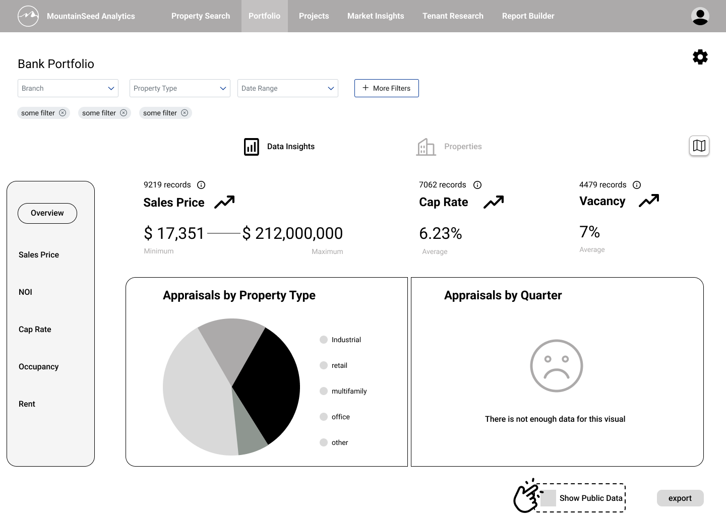
The first iteration tested whether all three services could live on a single portfolio page. Kept deliberately low-fidelity — but styled to MountainSeed's existing visual language to keep brand identity legible — it let users enter the portfolio to a map of their collateral properties, an analysis area, and a consolidated properties list below.
To shorten the learning curve, I borrowed interaction patterns from Microsoft Excel — applying Jakob's Law (users carry expectations from the tools they already live in) so analysts felt familiarity to the most prominent data analysis tool.
The map and analysis area sat in immediate view, since lenders want a snapshot of performance and value first. The interactive map let them move across geographic levels and filter; the analysis area displayed portfolio-driven visualizations and metrics compartmentalized by data type.
Why compartmentalize by data type?
Our research showed each institution runs its own lending and acquisition
strategy, so a one-size-fits-all dashboard couldn't deliver uniform value.
Through a tabbed interface, users could move between data types, pairing
one or two visualizations with supporting metrics for each. I produced two
options for the analysis area to compare information architecture (IA).
Full portfolio view: map, analysis, and properties in one page

Analysis area — IA option A
Analysis area — IA option B
Consolidated properties lived below the dashboard with a card / list toggle. Because this area needed less functionality at this stage, I kept it a lower priority and concentrated exploration on the dashboard and its visualizations.
Separating the workspaces
Holding all the workspaces on one page created competing demands on the user's attention. In the second iteration I split them into a tabbed interface to reduce cognitive load, and introduced a local navigation menu so users could control which insights were in view — freeing the dashboard to show deeper, more relevant visuals.
I also introduced market comparisons directly into the visualizations (benchmarking portfolio against market), and added properties actions like adding a property and viewing comparables. Card templates were still on the backlog, so those screens used placeholder content.
Analysis workspace, now its own tab
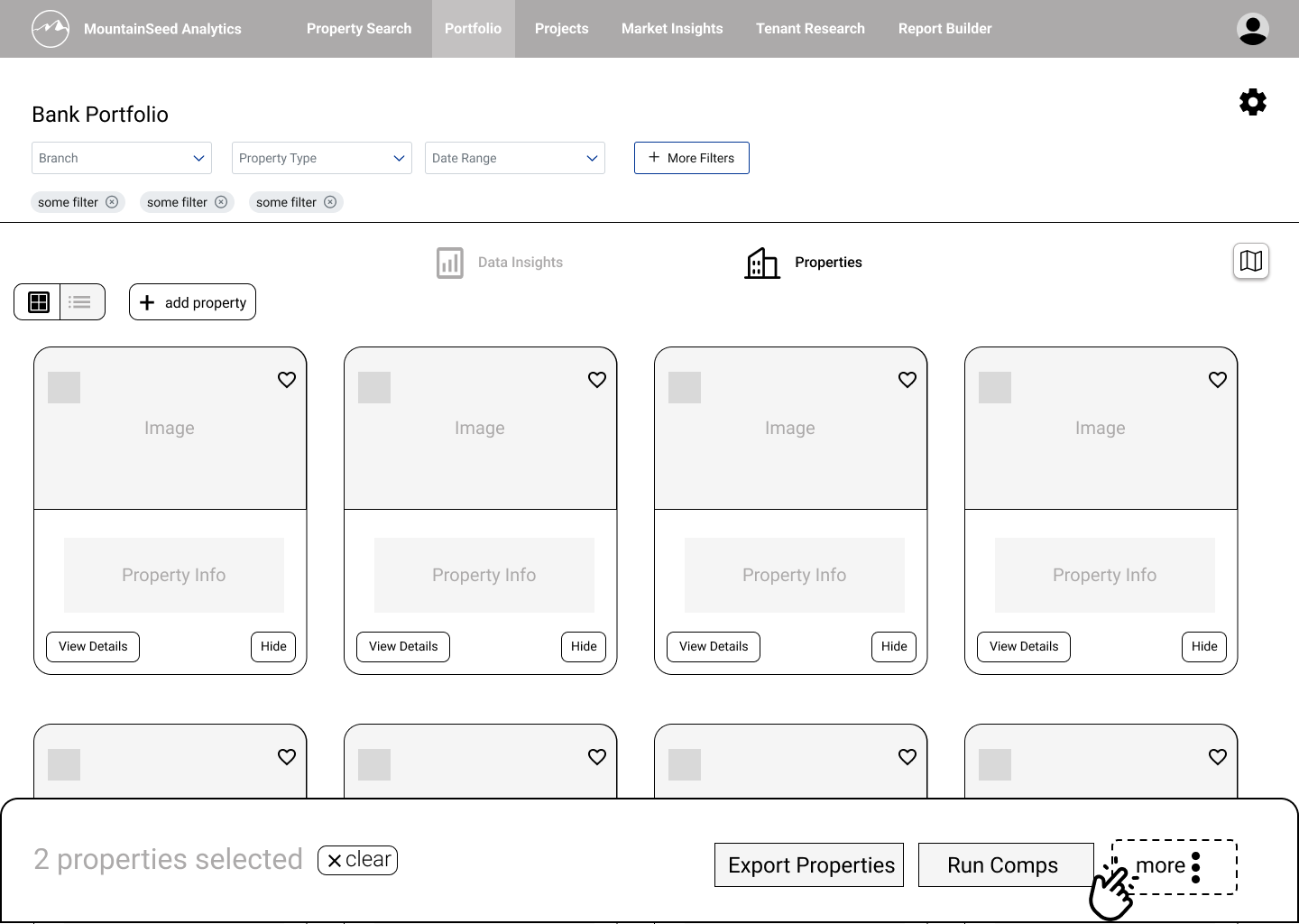
Properties workspace
I also designed the export flow, with journeys originating from both areas. I set the map to be hidden by default and opened on demand into a split-screen via a button — applying progressive disclosure to prioritize core tasks like exporting and shorten the process of common workflows.
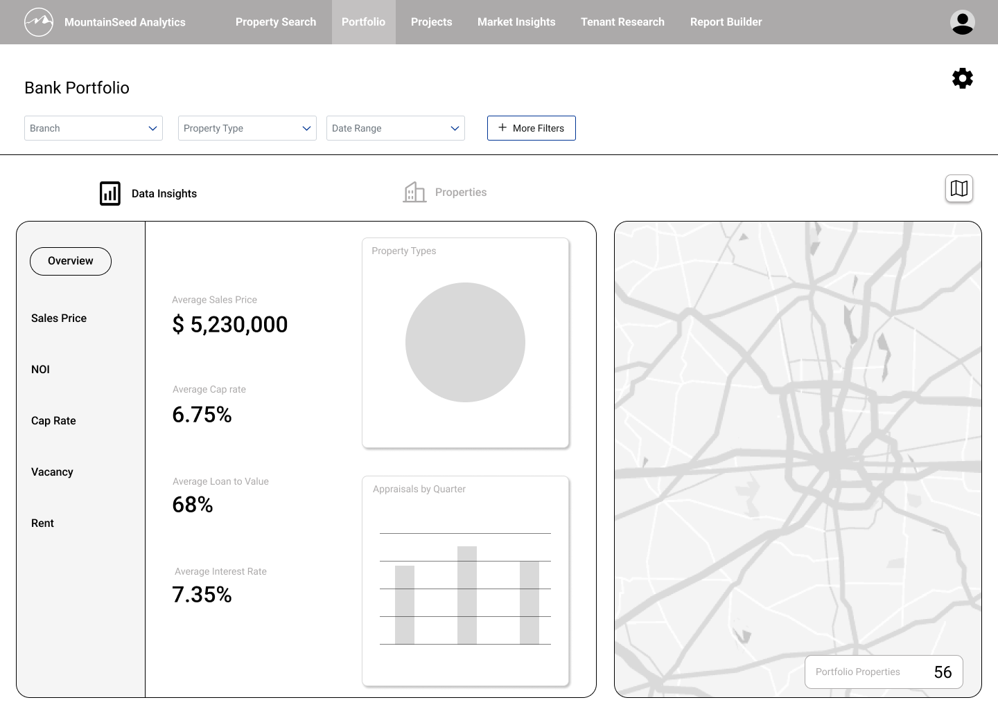
Map hidden by default, revealed as a split-screen on demand
Export flow — origin point in the properties area
Building analytical depth
With the structure settled, I emphasized work on analysis workspace — the analysts' primary space, home to the most complex tasks and the least overlap with other roles, which made it our highest priority for upcoming usability testing. I deferred the properties and snapshot workspaces, keeping their screens low-fidelity rather than stopping work on them entirely.
Analysts need to run calculations, read visuals to inform strategy, and investigate the underlying data. That called for a workspace built around a primary visualization with controls to enrich it, supported by data augmentation and comparative layering.
Data visualization was never a single deliverable — it was an ongoing problem that shifted as the team learned what was technically possible. Getting it right meant working across three overlapping constraints: data-analytics principles, visualization-tool capabilities, and MountainSeed's actual property data. I held recurring sessions with senior data analyst Jake Gadbury to ground my research in the company's data and tools, and to review upcoming visualizations before I presented them in our weekly syncs.
"The challenge wasn't deciding what to visualize — it was identifying which visualizations we could faithfully produce with our data and our tools, without overpromising."
I added supplemental visualizations to give the primary chart context. A trend of cap rates over time, for instance, becomes more credible when the user can also see average Net Operating Income (NOI) and a comparison of Market Sales Price vs. As-Is Value across the same period.
Research into visualization technique also revealed that analysts read charts through three lenses: assessing risk, reading trends, and understanding distribution. I chose an optimal chart type for each lens and added a tabbed layer to switch between them.
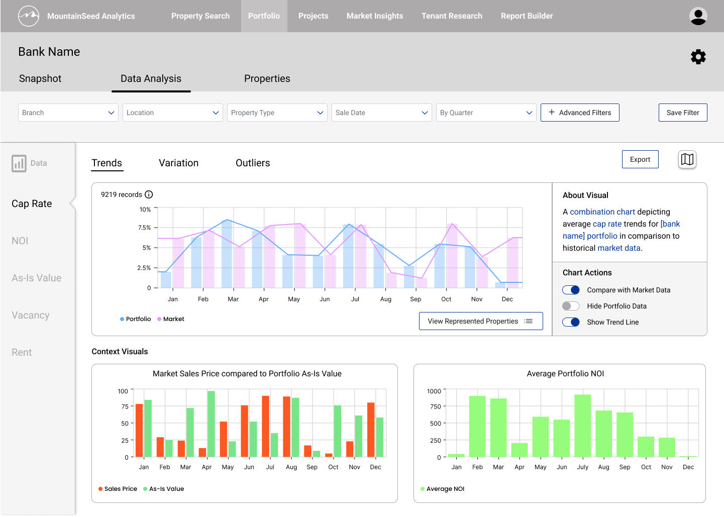
Primary visualization with supplemental context charts
Validating with users
The next iterations were shaped by usability testing. The headline finding: clients saw immediate value in the three-workspace model. An export-ready dashboard made it easy to deliver synthesized insight to executives; a consolidated properties area streamlined management and centralized property-level tasks like error reporting, detail edits, and running comparables.
No risk analysts attended our sessions, so the Risk view went largely unvalidated — a meaningful gap, since that SME feedback would have been the most valuable input on the workspace's most complex view. Executives and portfolio managers who did attend noted the risk tooling would be valuable if it could provide projections.
Rather than cut the feature from a lack of evidence, we decided the analysis workspace still held clear value for analysts and could be validated in a follow-up round with the right participants.
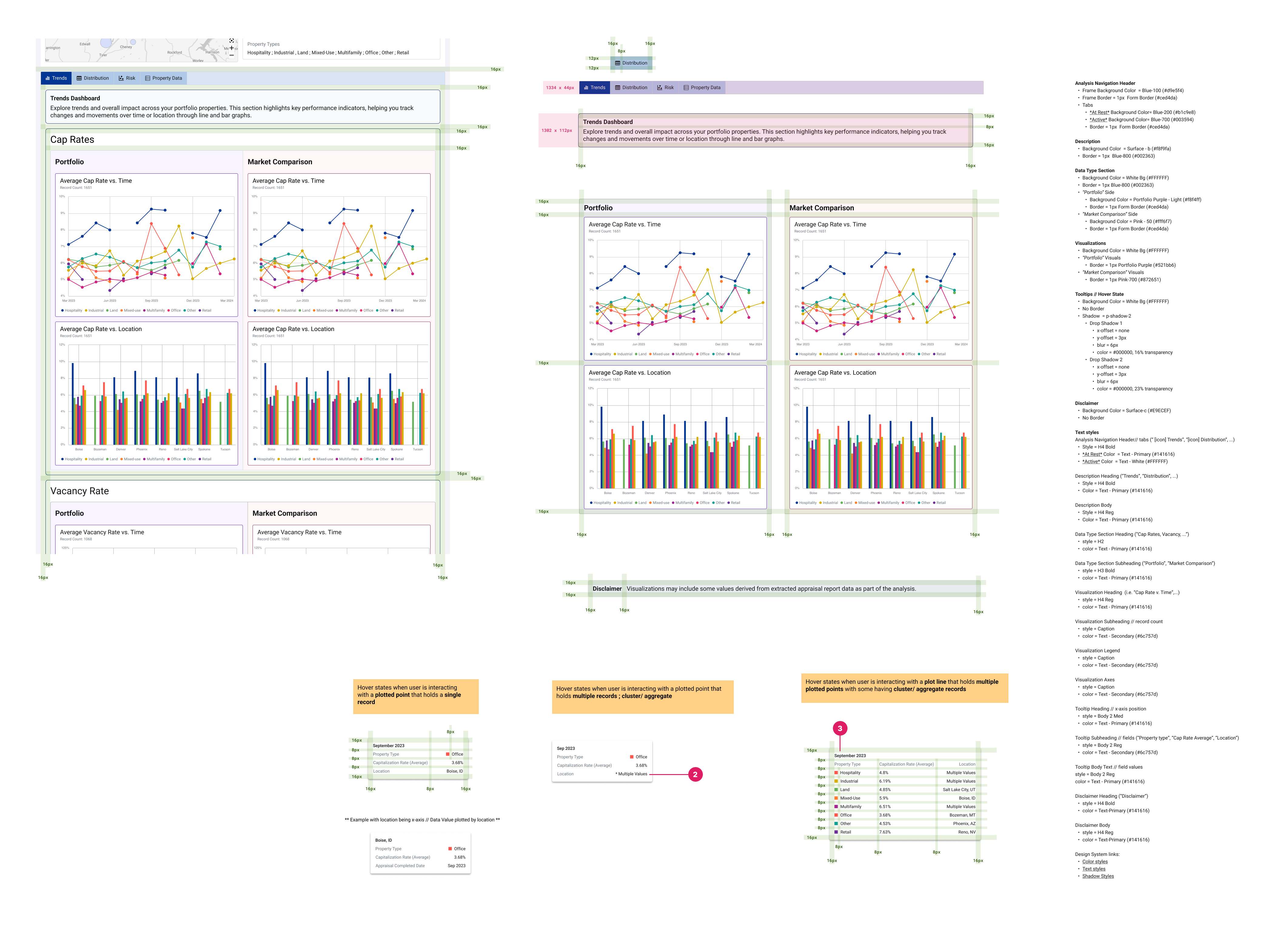
In the analysis workspace I built out a Chart Actions panel for richer data augmentation, added a toggle to fitler proeprty type within the visuals, and introduced an "About Visual" panel describing each chart. Placing that description directly beside the chart applies the spatial-contiguity principle — related information sits together, so comprehension doesn't depend on memory.
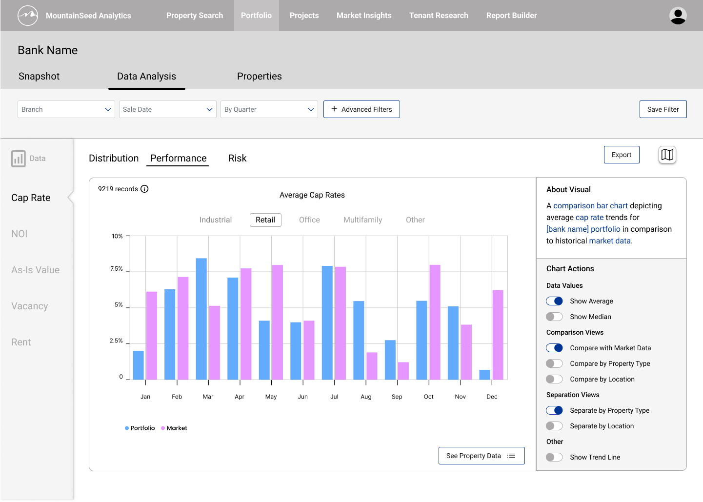
Performance view, with About Visual and Chart Actions
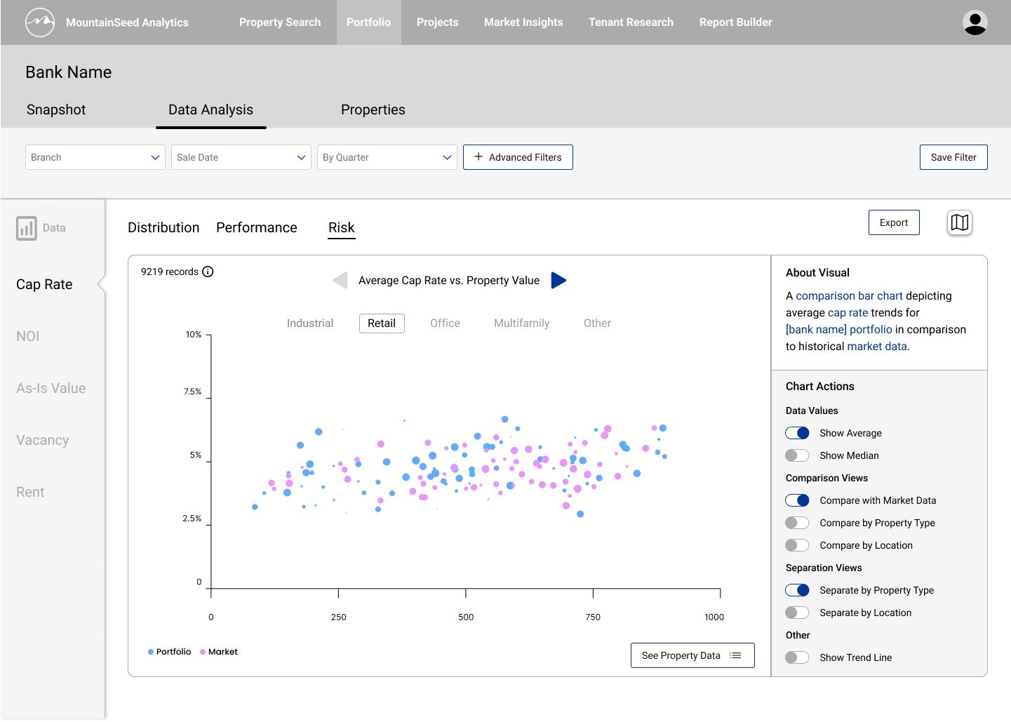
Risk view, the same chart read through a different lens
Testing also clarified what the Snapshot workspace should communicate: visuals for portfolio diversity, composition, and perfromance. I added a table of insights broken out by property type, since metrics across types aren't comparable and shouldn't be read against one another. Because Snapshot's highest priority task is fast, simple export, I limited its filtering to geography and time frame — the only two controls users need to set how broad or narrow a view they want.
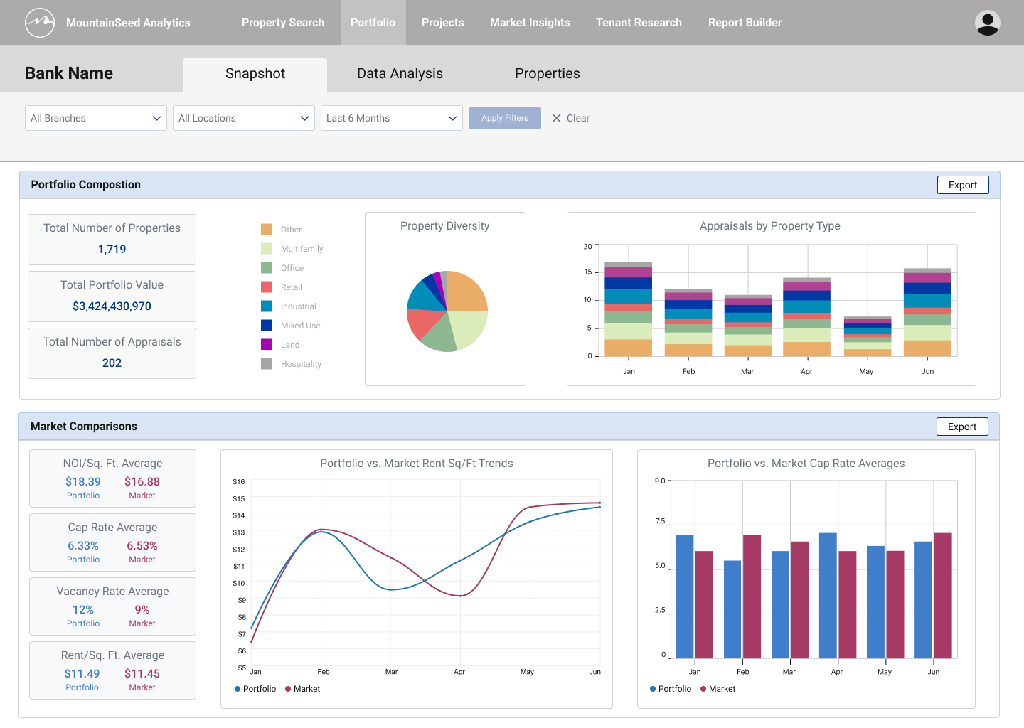
Snapshot, layout A: Composition over Market Comparisons
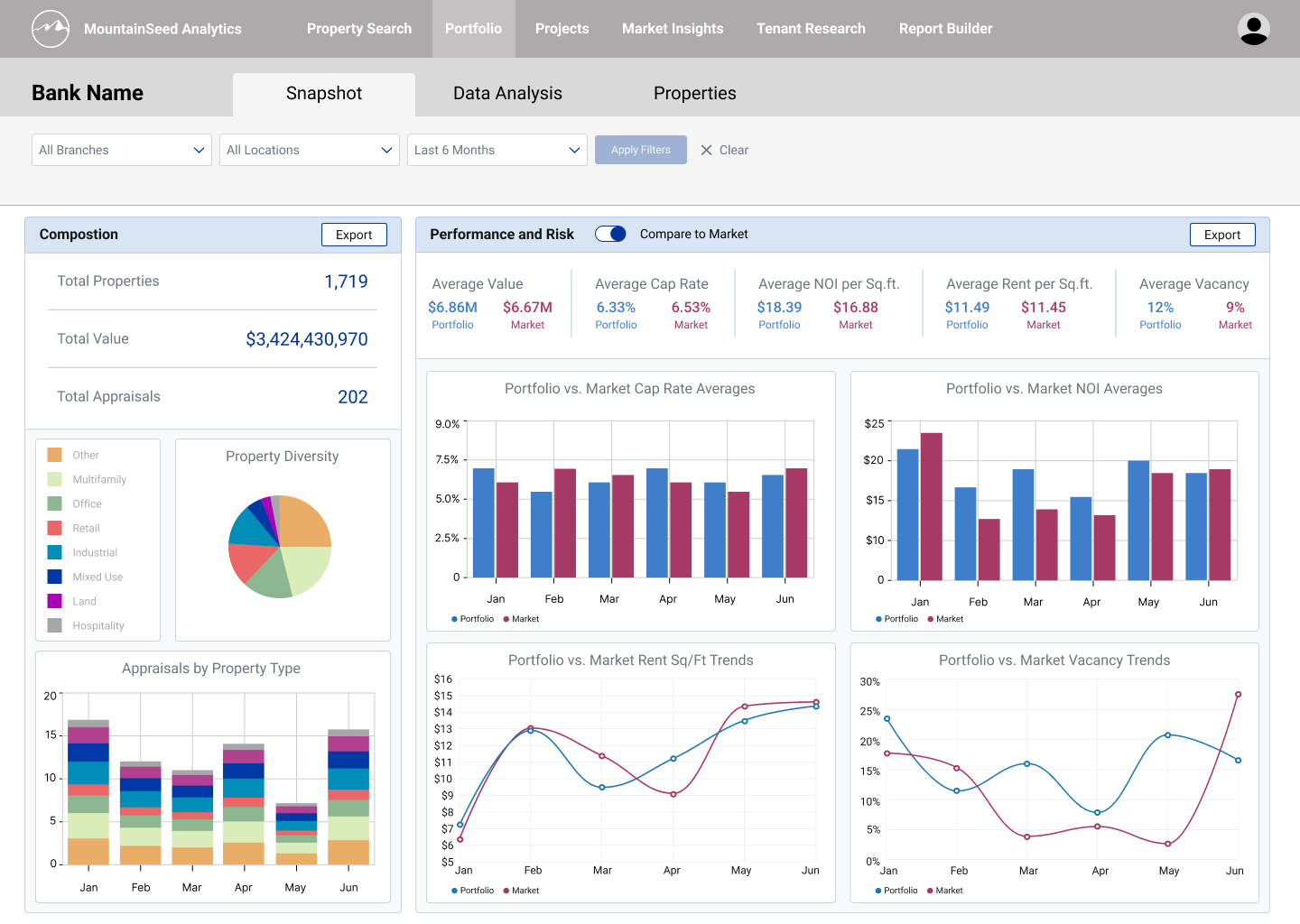
Snapshot, layout B: Composition beside Performance & Risk
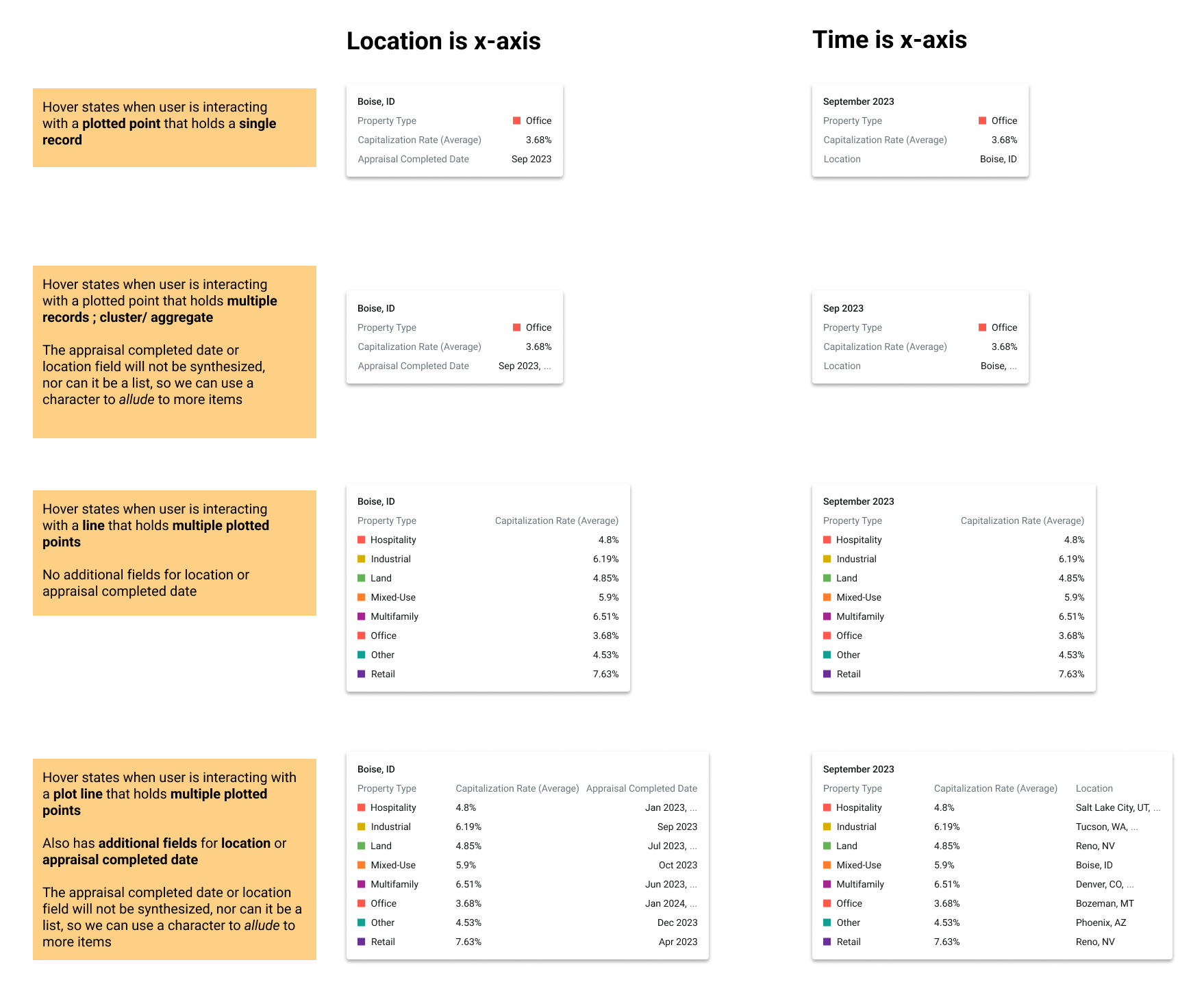
The Properties workspace already handled most workflows, but testing surfaced a new opportunity: error / ticket handling. Users told us property details routinely need to be adjusted, removed, or added to. I designed a side sheet ticket queue with three statuses — Pending, In Review, and Closed — so users could review active and past tickets, and added a flag affordance to mark any property attached to a ticket. Charts also gained a drill-down: selecting "See Property Data" opens the exact records behind a visualization. With this expedited flow, users could easily gather the property data informing a visual.
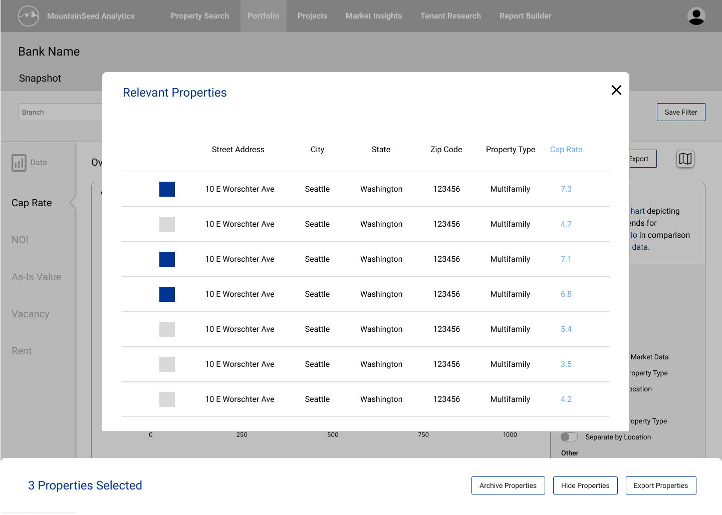
Drill-down from a chart to its underlying records, with bulk actions
The final prototype — designing for what could ship
Heading toward a first release, weekly syncs with the analytics team — Technology, Data Ops, and Project Management — made one constraint clear: the visualization technology and data pipeline needed more time to mature. So I designed the v1 release to the reality of what could ship, scoping back the dynamic visualization features and deferring the ticketing queue to a later release, since it had to connect to existing systems.
That made the analysis workspace more static; instead of customizing visuals and switching through a tabbed interface, users see a visual for each data type on a single page. Showing one visual per data type kept the space dense, but it solved an inclusivity problem — every client, whatever their strategy, finds the view they rely on without having to configure it.
I also designed a pivot-table view for users who prefer reading metrics as a table over charts. To inform how analysts traverse and read pivots, I drew on AWS QuickSight's documentation on visual types; we didn't adopt QuickSight, but it let me design pivot tables our existing Tableau tooling could build.
Finally, I brought the map back to the top of the analysis view alongside a summary of the active parameters — a "Dashboard Overview" — so the filters applied to the visuals below are always visible. Now that the visuals were static, the workspace could support export like Snapshot, and exported material needed to communciate the variables affecting the output.
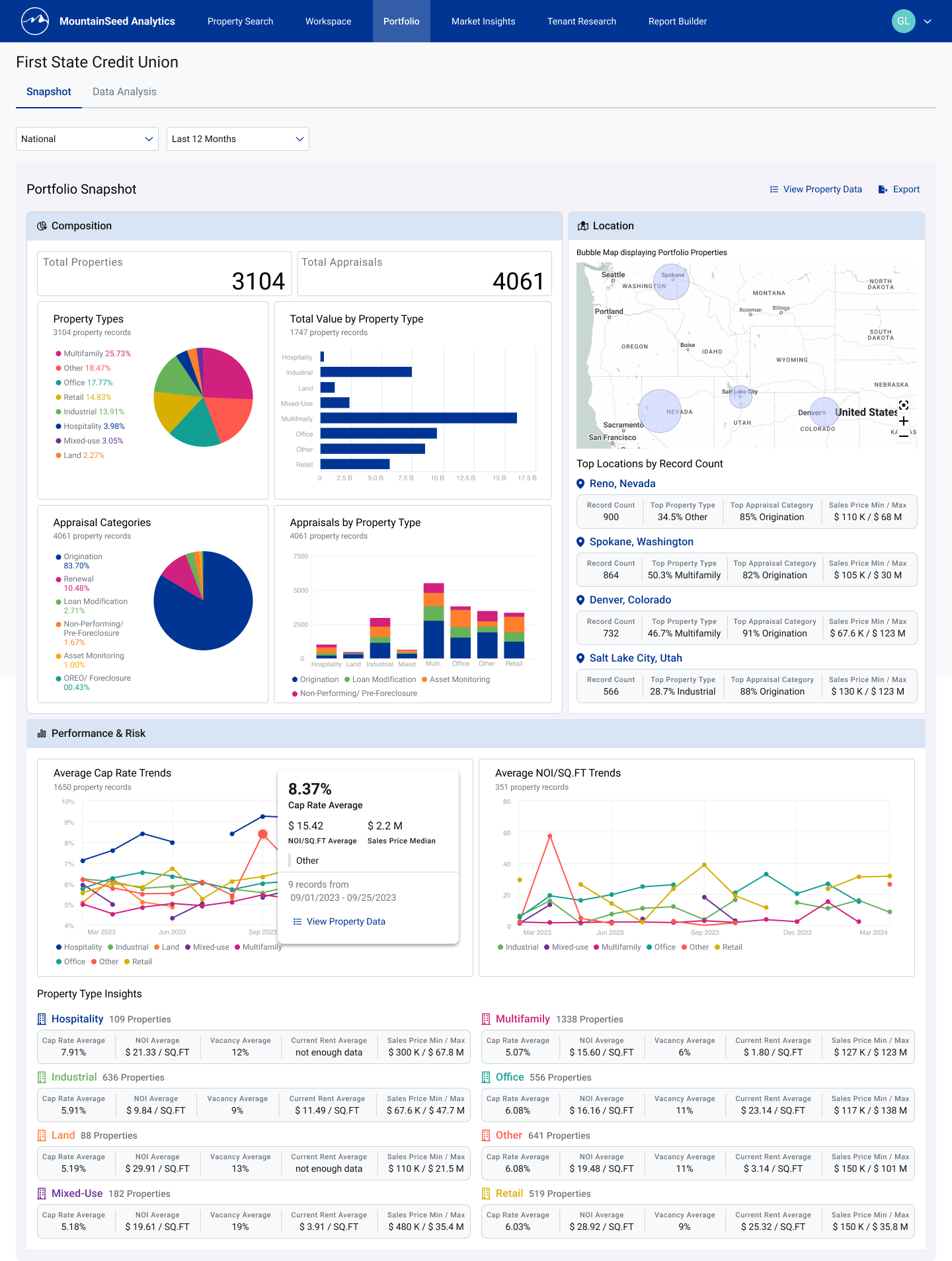
Final prototype — Snapshot: composition, location, performance & risk, and property-type insights
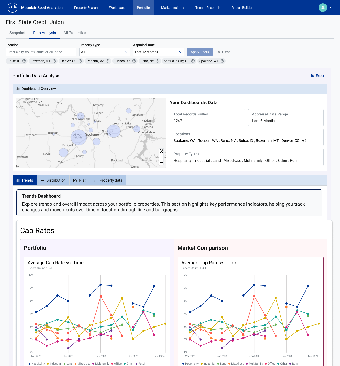
Final prototype — Analysis: a Dashboard Overview surfaces active parameters above portfolio-vs-market visuals
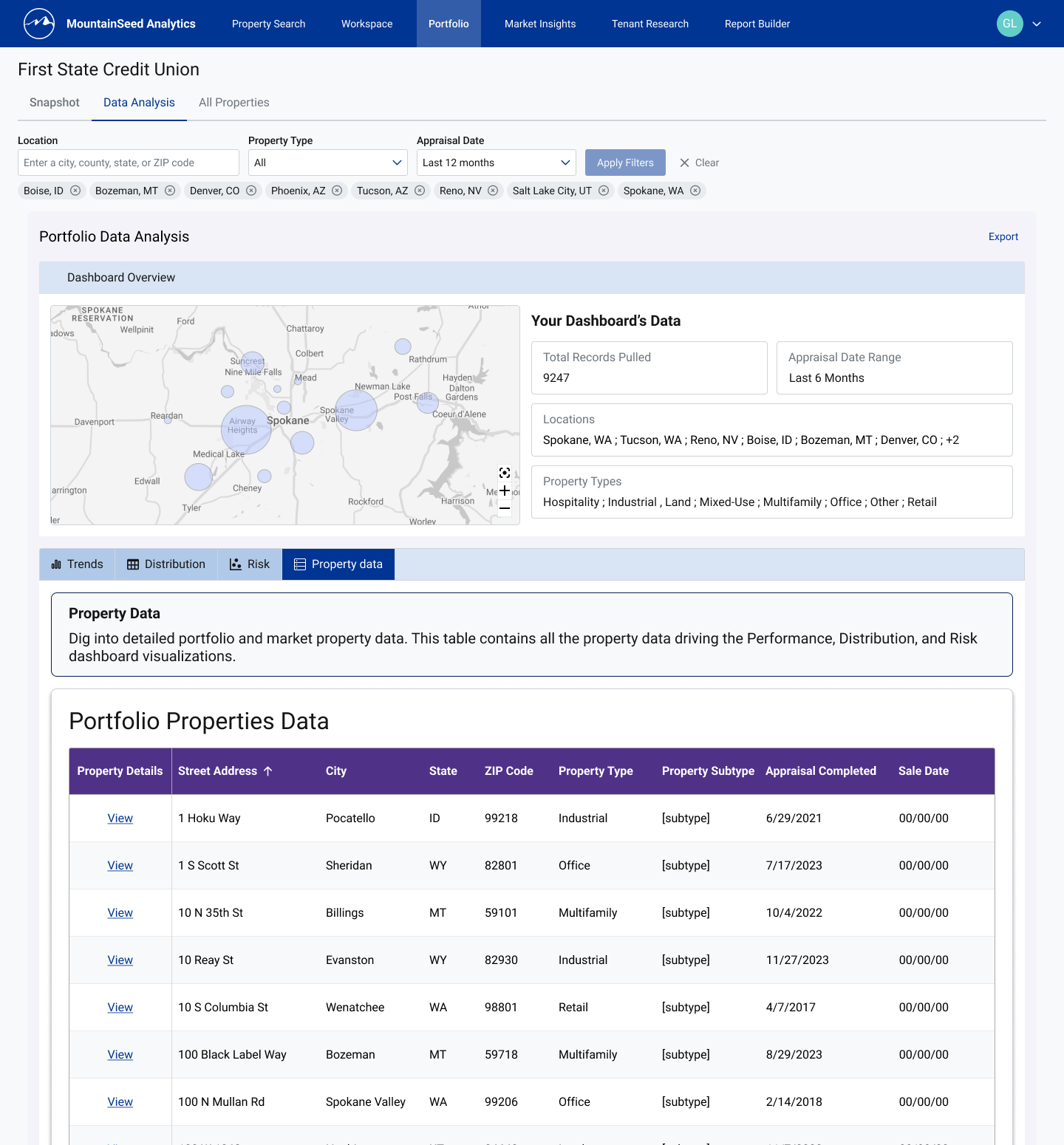
Final prototype — the Property Data pivot table, a table-first alternative to the charts
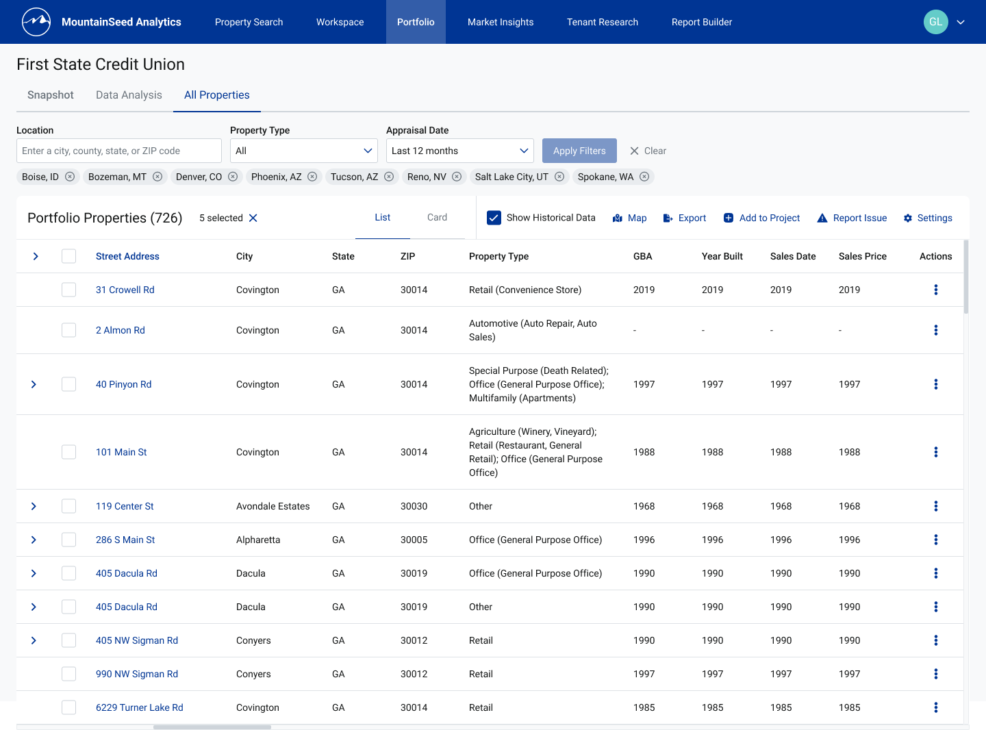
Properties — list view, with expandable rows and per-row actions
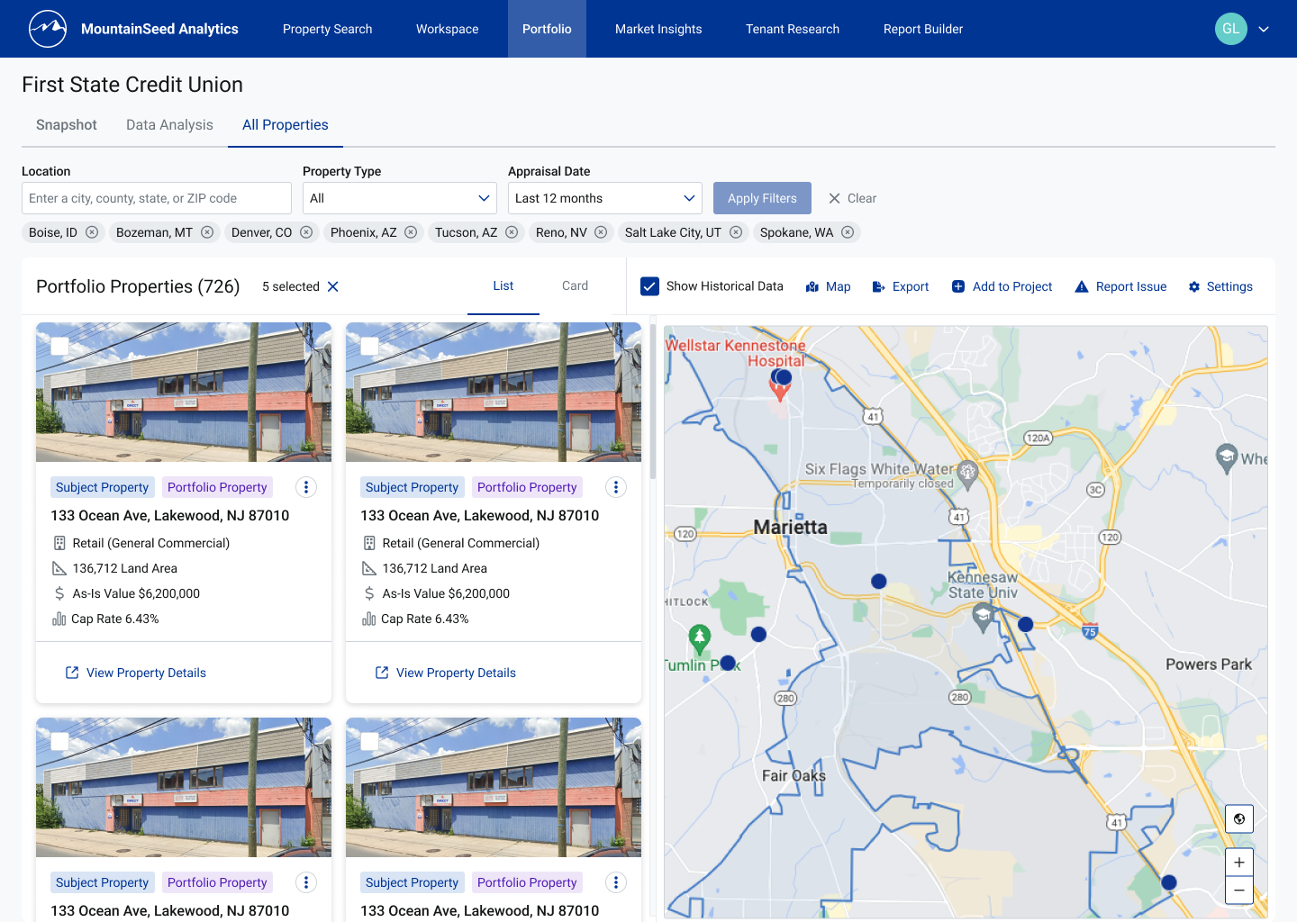
Properties — card view paired with the location map
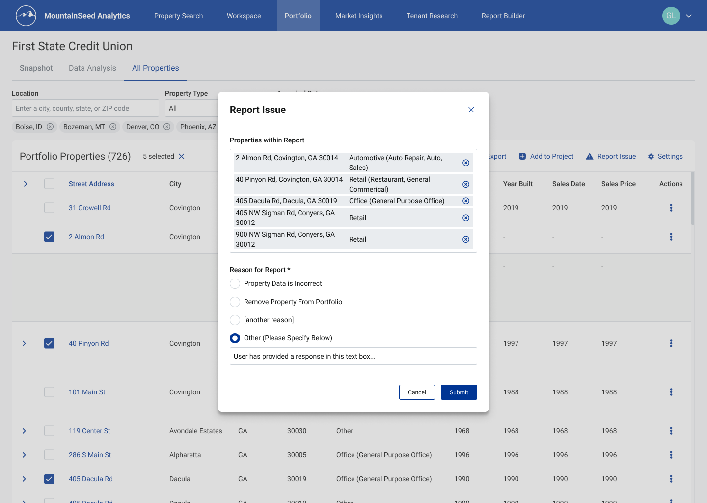
Report Issue — selected properties carried into a structured report with a clear reason
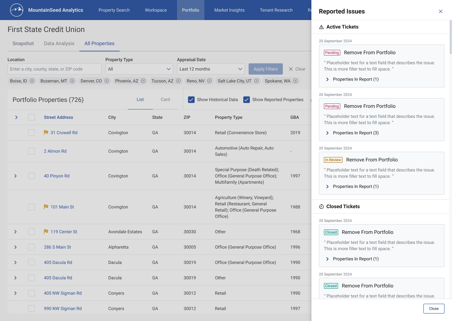
Ticket queue side sheet — active and closed tickets across Pending, In Review, and Closed
From prototype to production
Once the prototype screens were final, my role shifted to supporting development: providing revised specs when dimensions or spacing needed adjustment, and testing implemented pages as soon as they were available.
I documented QA findings in structured reports — organized by area, date, and sub-section — and noted areas that passed review as well as those that didn't, so the project manager had a complete, auditable record of what had been checked.
Analysis workspace - redlining and sizing
Tool Tips - usage and UX notes
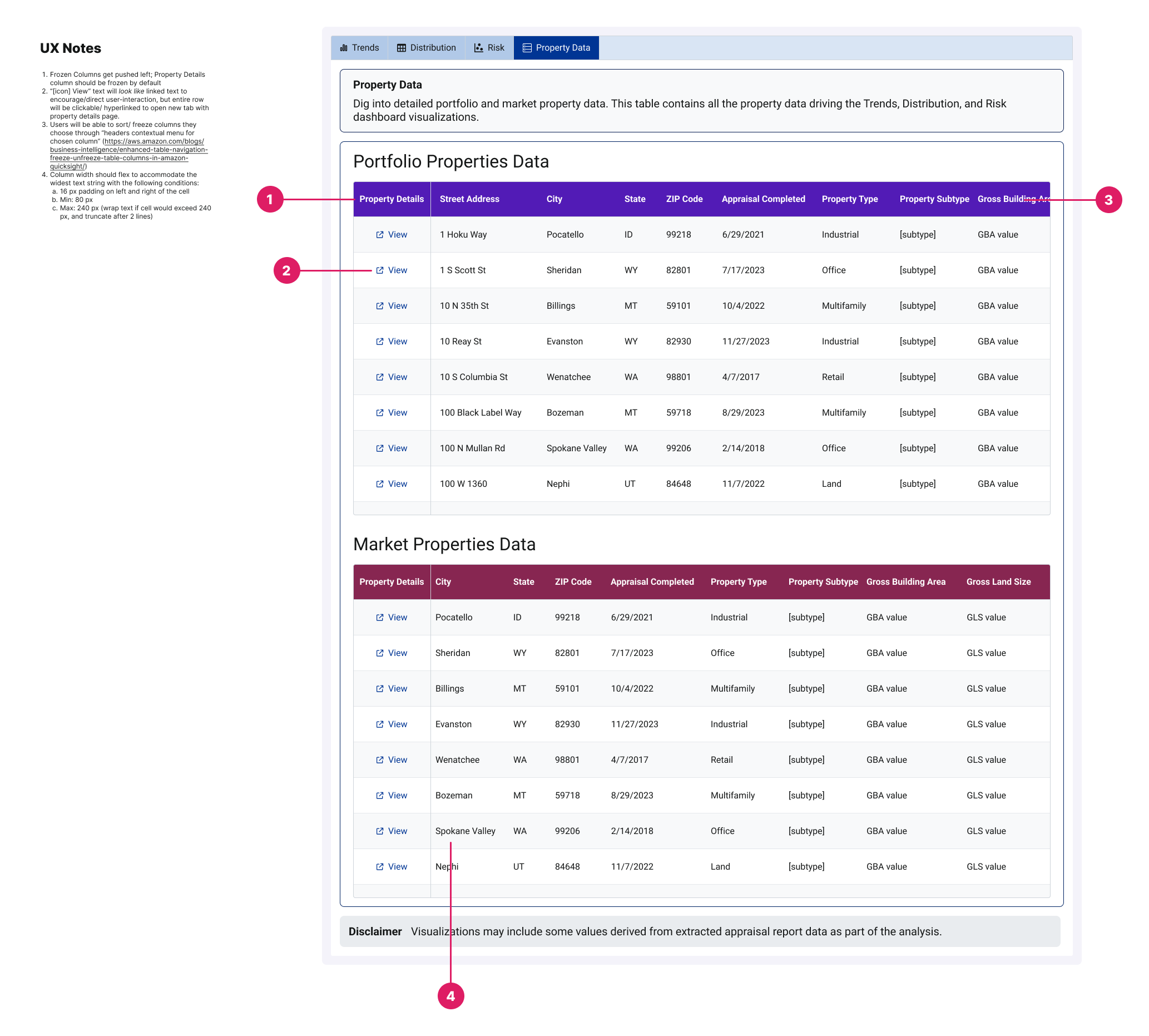
Analysis workspace - property data tables UX notes
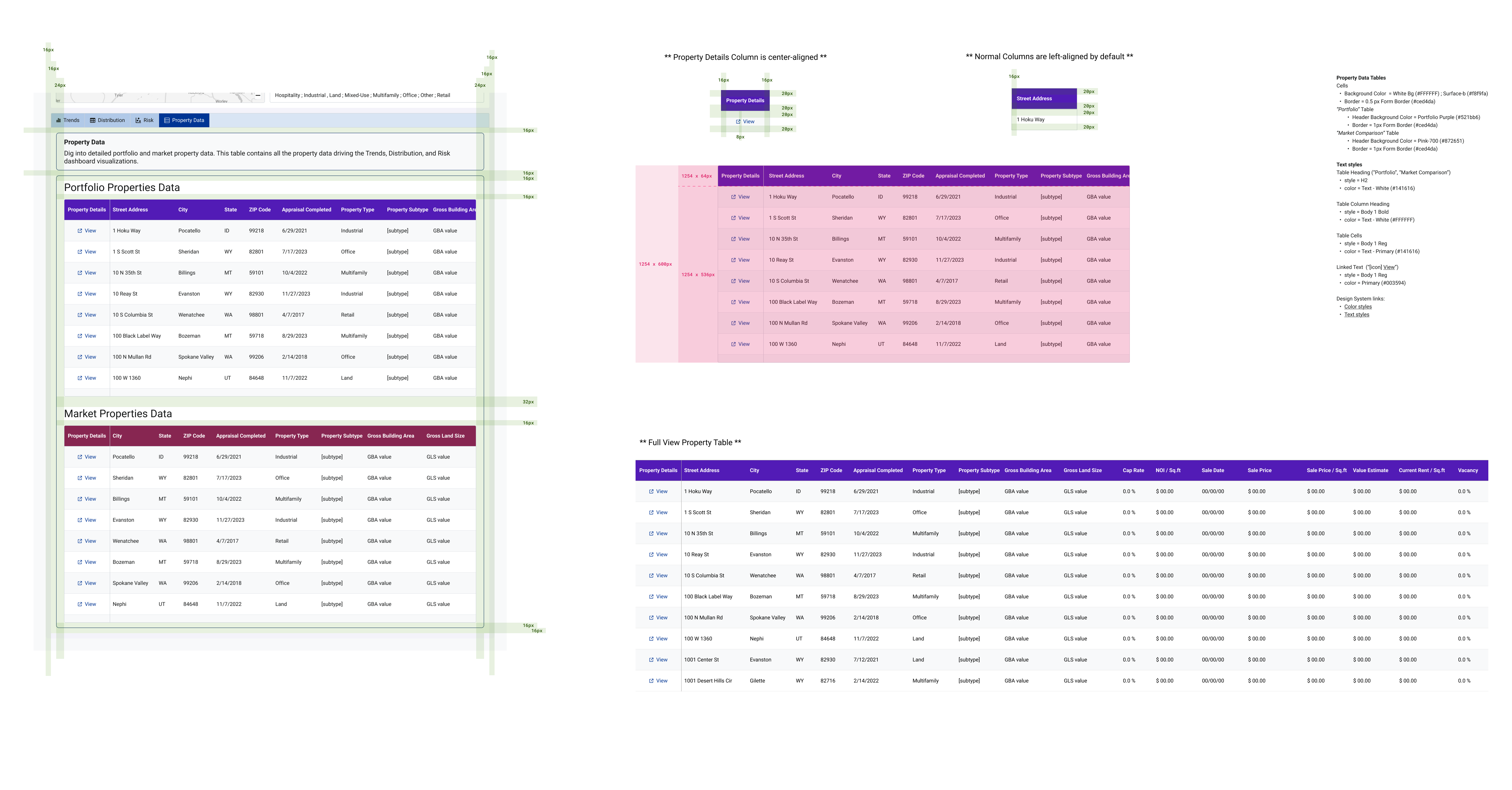
Analysis workspace - proeprty data tables redlining
What I took away
-
01
Design for the gap between desirable and producible. The hardest calls were in data visualization, where what's desired and what's acheiveable with our data tooling kept shifting. Learning when to push for clarity and when to design for ambiguity was the most valuable skill I built.
-
02
A full product lifecycle, end to end. Research, definition, IA, wireframing, hi-fi UI, prototyping, and production support — in a fast-moving fintech environment, with a cross-functional team — taught me to stay grounded in user needs while adapting to technical and business constraints.
-
03
Absence of evidence isn't evidence of absence. When no risk analysts joined testing, the disciplined move was to name the gap and plan to validate later — not to quietly cut the feature or pretend it was proven. Reality presents challenges that you have to identify and address without letting halt progress.
-
04
Team chemistry shapes the work. Cohesion didn't just affect morale — it influenced what got made. Being able to take risks and make mistakes without worrying about perception is what drives a team's efficiency and invention. As my first role out of college, that balance is something I'm grateful for.