Designing an AR airport experience for Apple Vision Pro
Kiwi was a collaborative project undertaken by four Interaction Design students using the Lean UX framework over eight weeks, from October to late November 2023. The brief was open-ended but focused: design a prototype for an AR app that makes the air-travel experience seamless, inclusive, and personalized — targeting the Apple Vision Pro as the development platform.
Air travel is a high-pressure, high-complexity environment where passengers routinely struggle with navigation, time management, and finding contextual information in unfamiliar airports. AR technology offered a meaningful advantage: integrated, customizable visual guides layered directly over the physical environment. It also gave us the challenge of designing something original and future-facing at a moment when AR applications were still largely uncharted territory.
"Our objective was to design a prototype for an AR app that makes the air-travel experience seamless, inclusive, and personalized."
Project goals:
- Make navigation assistance simple, intuitive, and customizable
- Provide route creation tools for travel assistance within airports
- Offer the ability to purchase and manage air travel-related services within the app
- Design for inclusivity and accessibility
- Design an interface for development on the Apple Vision Pro headset
A problem worth solving, and a method to match
Our team identified a clear pattern in existing air travel products: widespread failures in accessibility, accuracy, and overall user experience. AR technology offered a structural advantage that conventional apps couldn't replicate. Integrated, customizable visual guides that work in the context of the user's physical environment rather than requiring them to step away from it. It also gave us the challenge of designing something genuinely novel at a moment when the platform itself was still new.
For our design method, we used an adaptation of the Lean UX framework — a process centered on cross-disciplinary collaboration within short timeframes, with continuous learning through iterative design as its core operating principle. In the words of Jeff Gothelf and Josh Seiden, Lean UX "brings the nature of a product to light faster, in a collaborative, cross-functional, and user-centered way."
Our timeline was eight weeks: two three-week sprints, followed by two weeks of refinement. Working in person was ideal but challenging — our team was composed of full-time students with varying schedules. Frequent virtual communication within Microsoft Teams became essential to maintaining a proactive working environment within those constraints.
Structuring assumptions before designing solutions
The Lean UX Canvas guided the team through a structured set of collaborative brainstorming exercises before any design work began. Its purpose is to surface and articulate a team's initial assumptions — establishing a shared foundation for hypotheses, design plans, and testable MVPs. This allows teams to validate ideas quickly while minimizing wasted effort.
An early example of speed with Lean UX
We initially assumed that Kiwi's value would be concentrated in airports the user was
unfamiliar with. Through interviews and testing, we found the need was
consistent regardless of how familiar a traveler was
with a given airport. This shift would greatly affect how we scoped
the product.
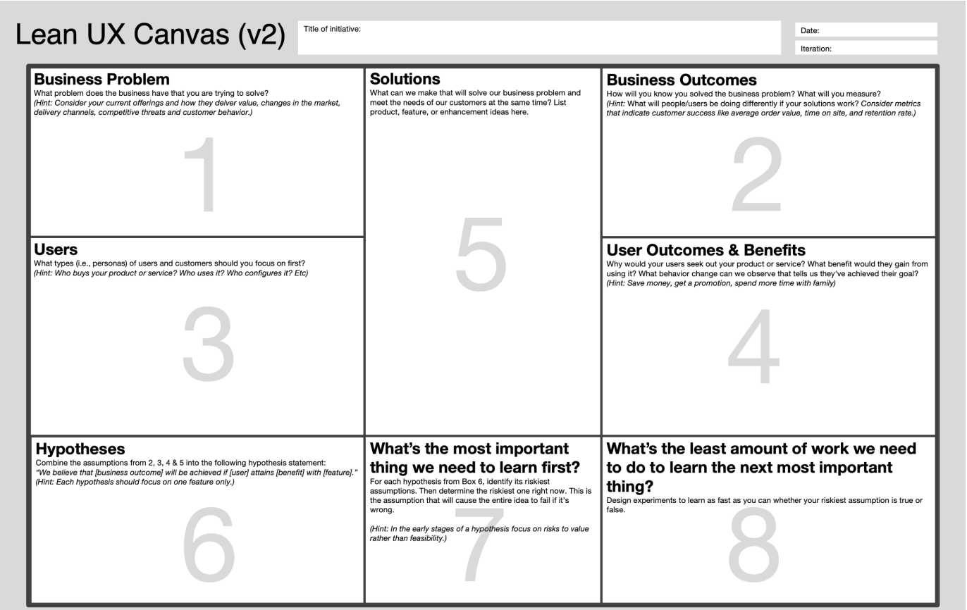
Lean UX Canvas template
Mapping the core experience
At the start of each sprint, the team worked through the Lean UX Canvas together — conducting research and brainstorming exercises for each component. Meetings were facilitated in person, supplemented by ongoing coordination in Microsoft Teams. From this work, we built a product backlog to track proposed solutions and hypotheses, and a sprint backlog defining which items would be built and tested in Sprint 1.
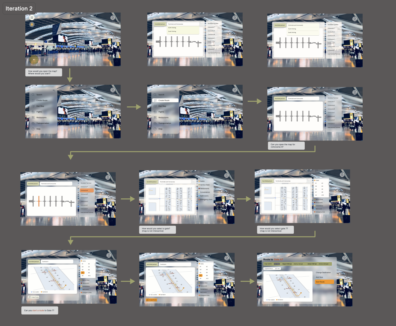
For Sprint 1, we identified four design plans as our MVPs: Visual Waypoints, Navigation Assistance, Route Creation, and Purchase Portal. Each corresponded to a hypothesis in the sprint backlog. We divided the MVPs among team members to maximize our time. I was assigned Navigation Assistance — the user journey for following the route to a set destination. For testing, this required a sequence of screens that would allow interviewees to use the Think-Aloud protocol, verbally articulating their emotions, logic, and decisions as they moved through the experience of using kiwi's navigation.
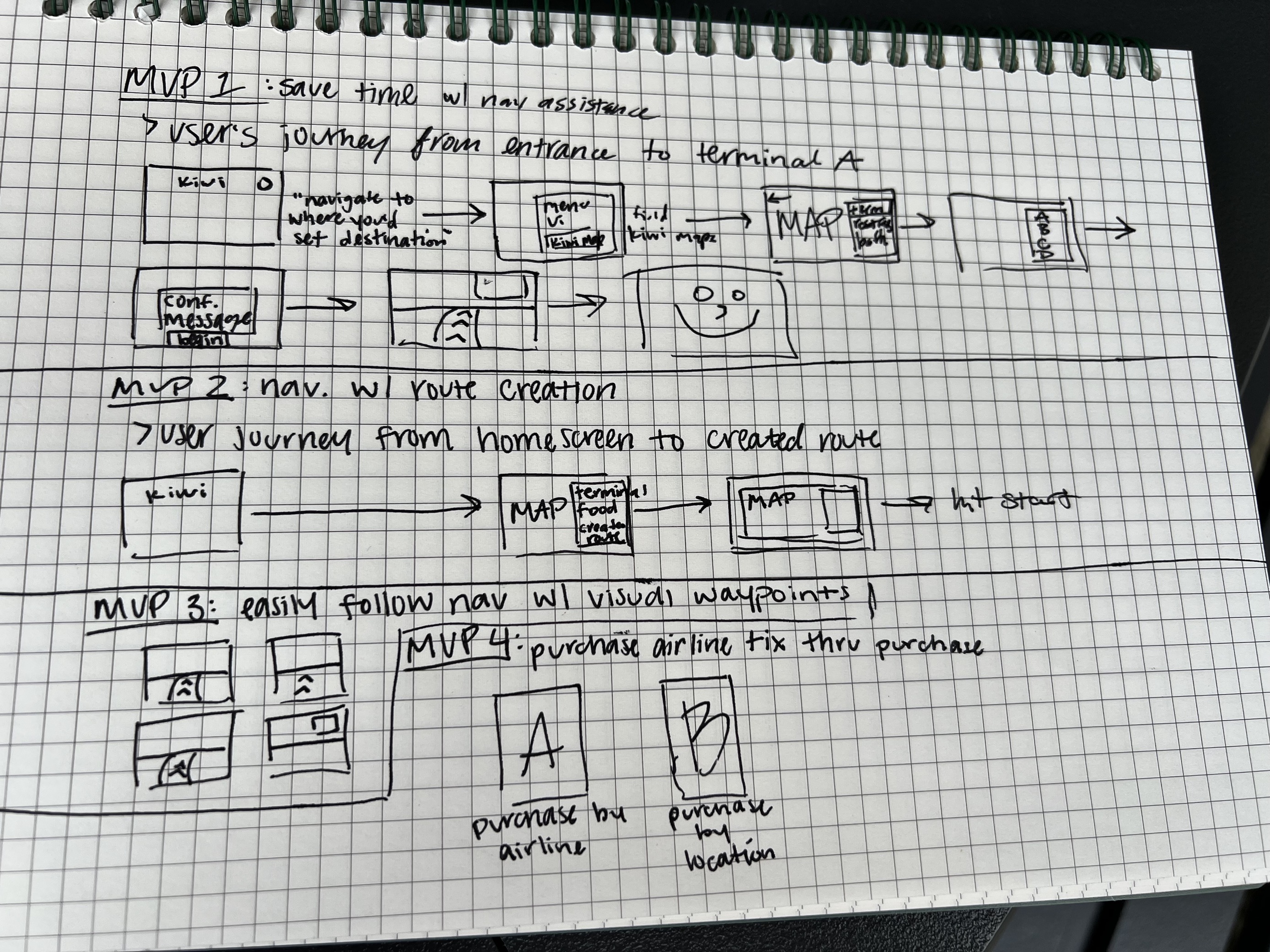
MVP planning - written sequence of initial MVPs
Our proto-persona
As part of the Users section of the canvas, the team built a proto-persona based on our collective assumptions about who would use Kiwi and what they would need. A proto-persona is constructed without prior user research and is intended to evolve as the product develops.
Our persona is Loren Hayes, an auditor who travels frequently and encounters consistent friction: inefficient navigation, limited contextual information about the airport environment, and the pressure of time-sensitive tasks. These obstacles were projected onto a personality the team built together, and served as the anchor for our design decisions throughout Sprint 1.
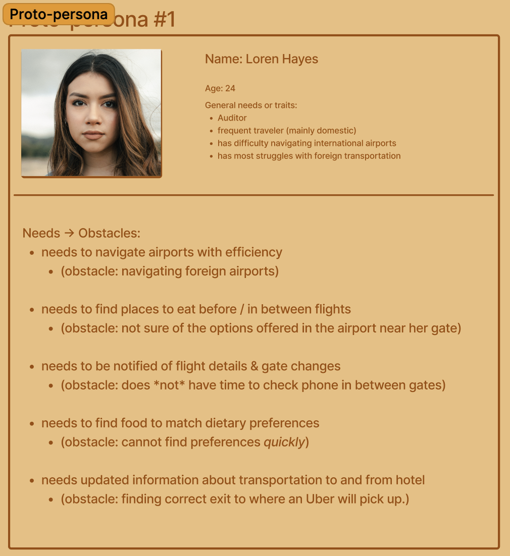
Sprint 1 proto-persona — Loren Hayes
The remaining two weeks of Sprint 1 were dedicated to user research interviews and iterative MVP development. We scheduled five interviews with participants matching our projected user type. Due to our time constraint, the first session was conducted without any MVP artifacts — focusing instead on open-ended inquiry to learn about the target audience. In subsequent interviews, participants began with open-ended questions before being guided through the current MVPs. Designs were updated between each session, and we completed four iterations in total.
One significant shift emerged near the end of the first week. While working on Navigation Assistance, I realized that a critical part of the flow — route creation — had been assigned to another teammate, Michelle Hayden. Route creation would show the user journey to set a custom route originating from the homepage, and would incorporate the maps feature. In our initial iteration, we had designed separate screens for each. Recognizing the overlap, Michelle and I decided to develop our MVPs as a pair. We still kept Navigation Assistance and Route Creation separate for testing purposes, but worked together from that point forward. My responsibilities remained focused on the user journey screens and interface styling — but this pairing also meant taking on significantly more depth with the interactive map feature.
Sprint 1 - kiwi maps first iteration
Sprint 1 - kiwi maps final iteration
Sprint 1 retrospective
The retrospective was conducted at the end of the second week through a virtual meeting, using a template provided by the course instructor. Team members shared thoughts anonymously via digital post-its — cameras and microphones off — to keep responses honest and unbiased.
What went well: The team maintained strong chemistry, communication, and work ethic throughout the sprint. Our iteration pace stood out — the MVPs consistently reflected feedback from the prior interview session, showing that research was being actively integrated into the design.
What could have gone better: While the interviews were productive, we all identified a need for better organization and structure in how walkthroughs were moderated, and cleaner transitions between MVP segments. UI consistency was also raised — we needed to establish and apply a defined style system across the product.
What we would try next: The team aligned on one goal for Sprint 2 — a functional prototype. We wanted a dynamic, interactive experience ready for the next round of users, which meant narrowing our focus to complete, consistent interactions for the core features, integrated into a coherent flow.
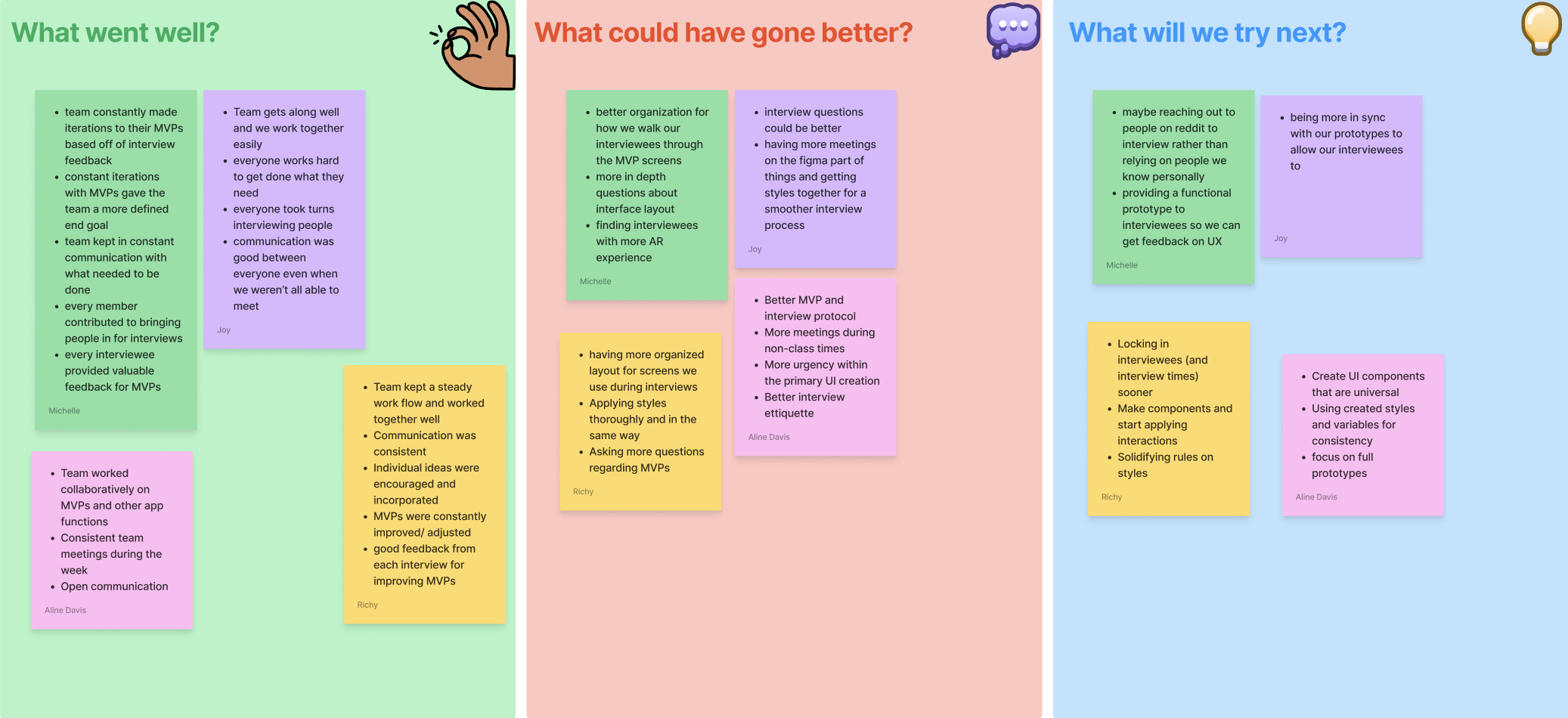
Sprint 1 retrospective template — anonymous post-its
Refining for real-world use
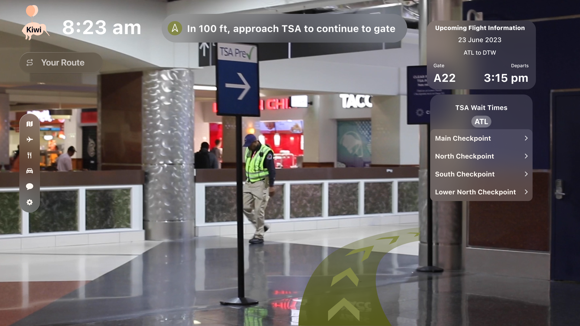
Entering Sprint 2, the team revisited the Lean UX Canvas with new insights gathered from Sprint 1 research and user feedback. The business problem was updated to reflect newly surfaced struggles — navigation near car rental facilities and accounting for TSA wait times. The proto-persona was expanded to address additional needs: assistance with trip planning and timeframe management, access to live store-hours information, and guidance on exit routes.
These updates cascaded into the outcome-to-impact mapping, which was revised with new leading and lagging outcome paths. We added three new hypothesis statements — introducing a trip planner feature, TSA wait time integration, and in-app pop-up screens for restaurants and stores — and removed three prior statements that had become redundant. After reordering prioritizations and updating the risk and MVP tables, we built the Sprint 2 backlog.
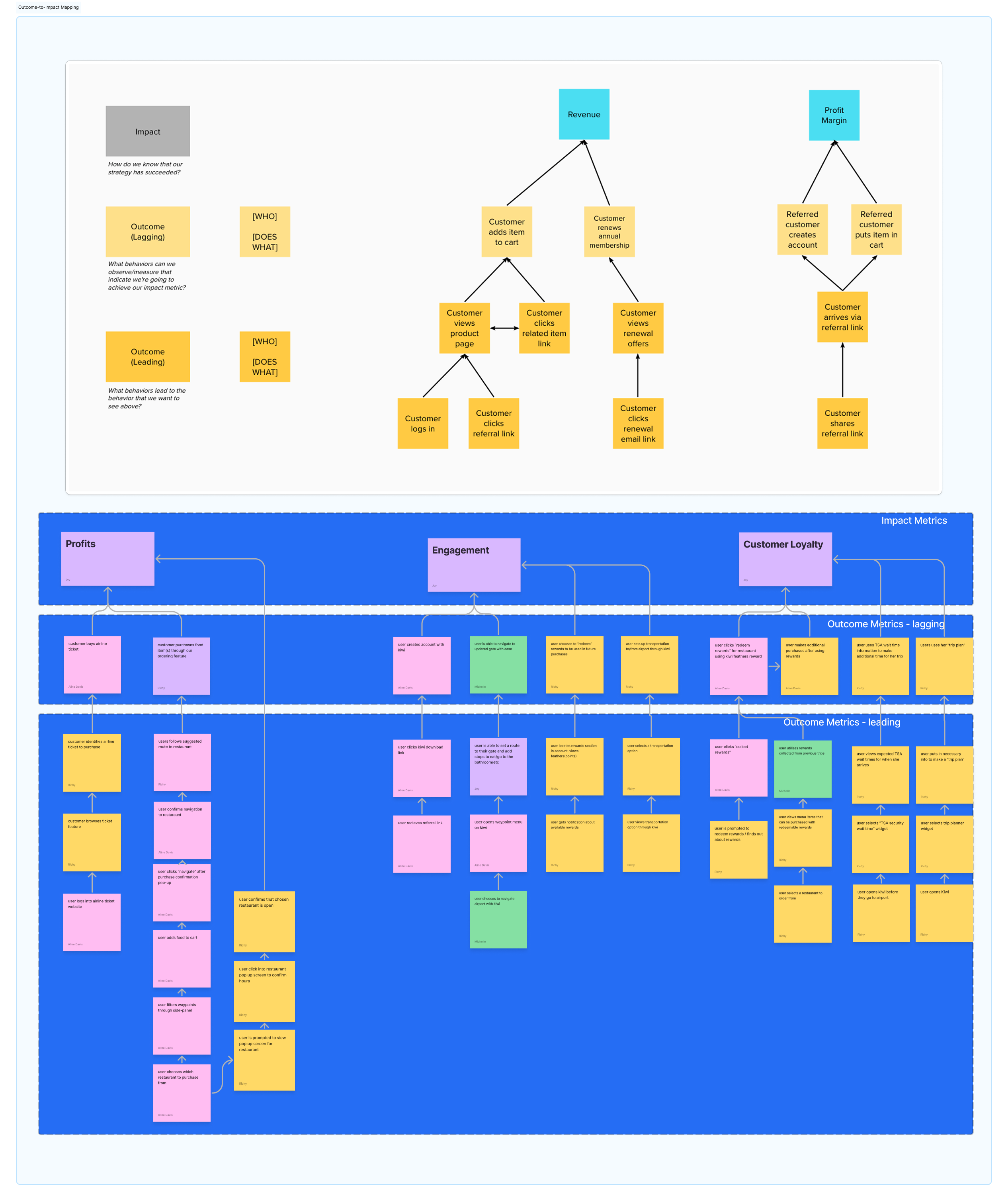
Sprint 2 design week — updated Lean UX Canvas with new outcome-to-impact mapping
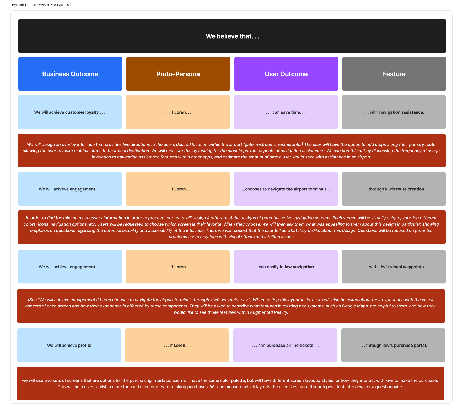
Sprint 2 design week — updated Lean UX Canvas with new hypotheses
Sprint 2 followed the same rhythm as the first: continuously learning from interviews and refining designs in response. The key difference was that the product backlog and style system were now solidified, giving the Figma work significantly more consistency. Design plans became more narrowly scoped, so iterations focused on improving interactions rather than revisiting visual design; rough screens were converging into a final prototype.
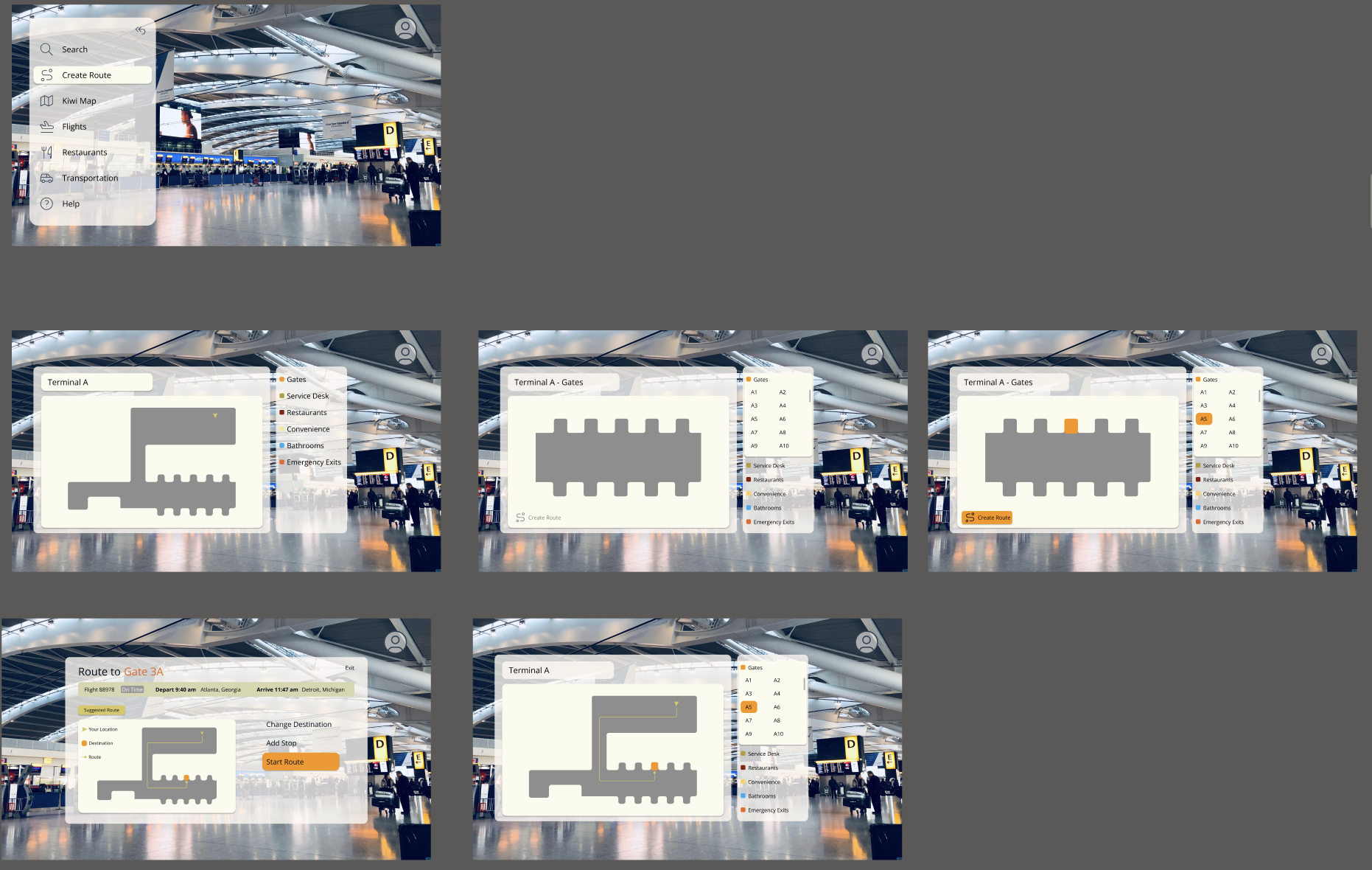
The most technically intensive work in Sprint 2 was the Kiwi Maps feature. Navigation Assistance and Route Creation had evolved from separate MVP flows into a unified product feature — and building it required an interactive, scrollable map component with actionable elements. To achieve this, I built a component set called map filtering with 32 variations covering every possible layout for map filter combinations. I constructed a nested filter bar component — also with 32 variations — that enabled click interactions to switch between map states. We configured over 130 interactions in total to support full navigational functionality within the feature.
Once the map component was complete, I designed the Kiwi Maps Interface: a component set containing both map filtering and a sidebar component with all sidebar navigation variations — providing the full interface context in which the map would be used.
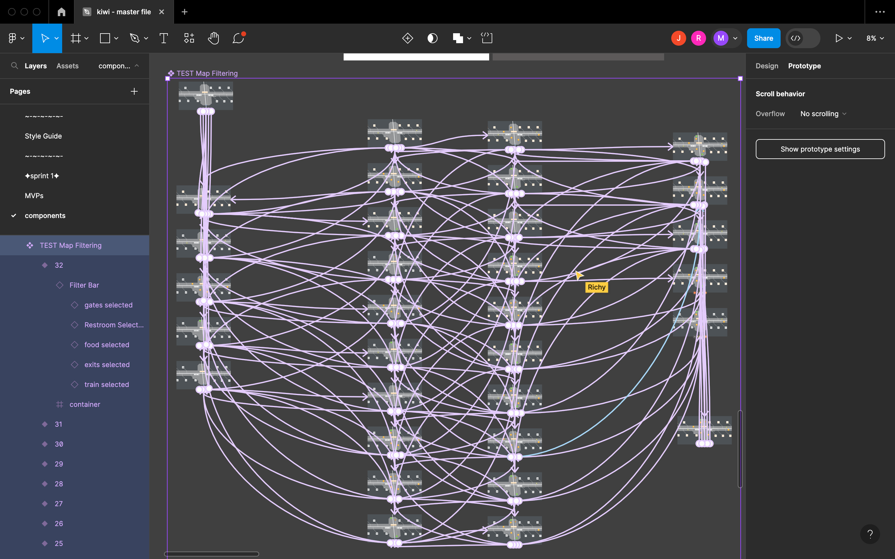
Sprint 2 - kiwi maps frame interactions
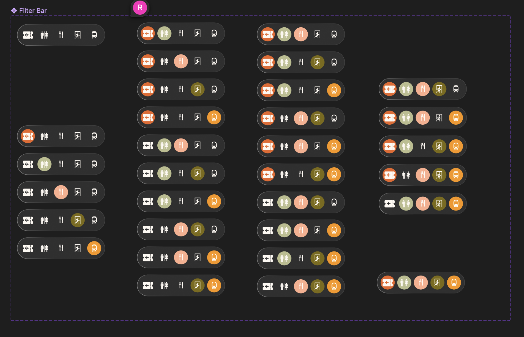
Sprint 2 - kiwi maps fitler bar component set
Sprint 2 retrospective
The final retrospective served both as a reflection on Sprint 2 and a setup for the remaining refinement phase. Consistent team collaboration and continuous learning remained our clearest strengths.
I identified two priorities going into refinement: completing screen connections across all prototype walkthroughs, and improving the visual waypoints frames — which had not yet reached the same design quality as the rest of the project. The team also agreed that visual waypoints would be more effective as an AR experience if the frames contained a video background.
Finalizing flows and resolving prototype constraints
Refinement was the final phase of the project — dedicated to polishing screens, finalizing user flows, and resolving outstanding technical issues in the prototype.
The maps feature required dimensional adjustments and a new sidebar component set for the Concourse A entry state. I also made minor refinements to filter color choices and text styles within the map filtering component. After those changes, I reviewed every interaction in the prototype to confirm smooth transitions and correct placement throughout.
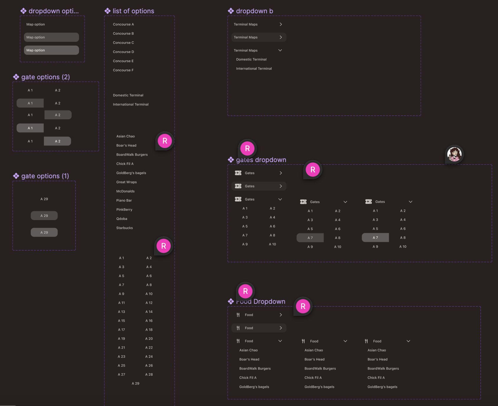
Kiwi maps - refined component set for side nav, filters, scenario-specific flow
The final unresolved challenge was connecting the route creation flow to the visual waypoints screen. A Figma constraint complicated this: component variant interactions cannot link to screens outside the component set unless the target is on the same page. To avoid duplicating the entire component set in the finalized paths page, I modified Kiwi Maps Interface to include screen backgrounds and a copy of the visual waypoints — making the final prototype self-contained within a single screen that encompassed the full user journey.
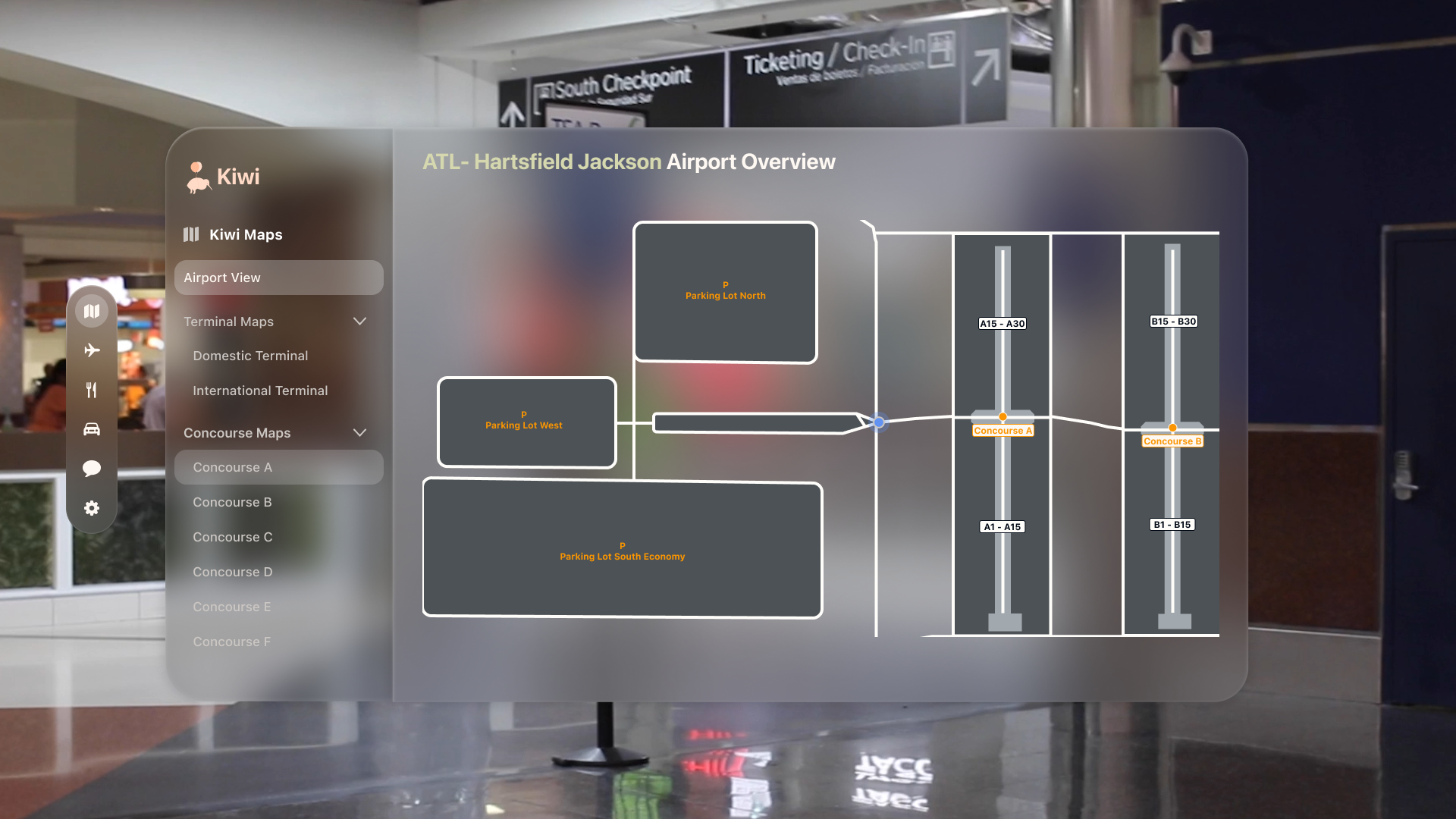
Kiwi maps - high-level airport view in maps interface
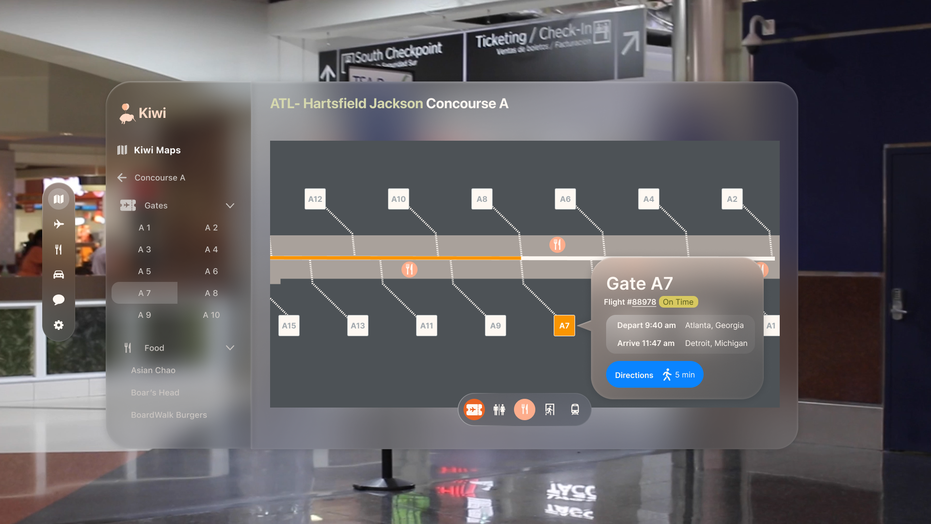
Kiwi maps - gate selection frame from Nav Assistance user journey
Visual waypoints - final prototype frame connected to Nav Assistance MVP
Visual waypoints were brought into the component as a variant, since that was the only screen accessed after the maps flow. These decisions limited total free-form interactivity, but they were the right trade-off given that walkthroughs would be guided during the presentation — and the alternative would have required significant time outside the defined project timeline.
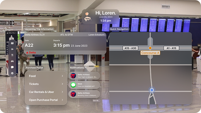
Kiwi - final prototype landing frame
What building Kiwi taught me
We shipped a high-fidelity prototype that the team was genuinely proud of. Working on Kiwi was challenging and intensive — and in equal measure, engaging and rewarding. Designing for a platform as new as the Apple Vision Pro meant operating without an established precedent, and working through a rigorous methodology with a team of four in eight weeks required a kind of disciplined communication I hadn't practiced at that pace before.
The Kiwi Maps interface still has room to grow — full manual interaction regardless of the prescribed user flow remains an open problem given the Figma constraints we encountered. But the prototype effectively demonstrated the core experience and gave users something concrete to respond to.
Lean UX delivered on its promise: the continuous cycle of designing, testing, and updating in short intervals meant we were always building from real user feedback rather than internal assumptions. That practice — staying close to the user through the whole process rather than just at the beginning — is something I've carried into every project since.